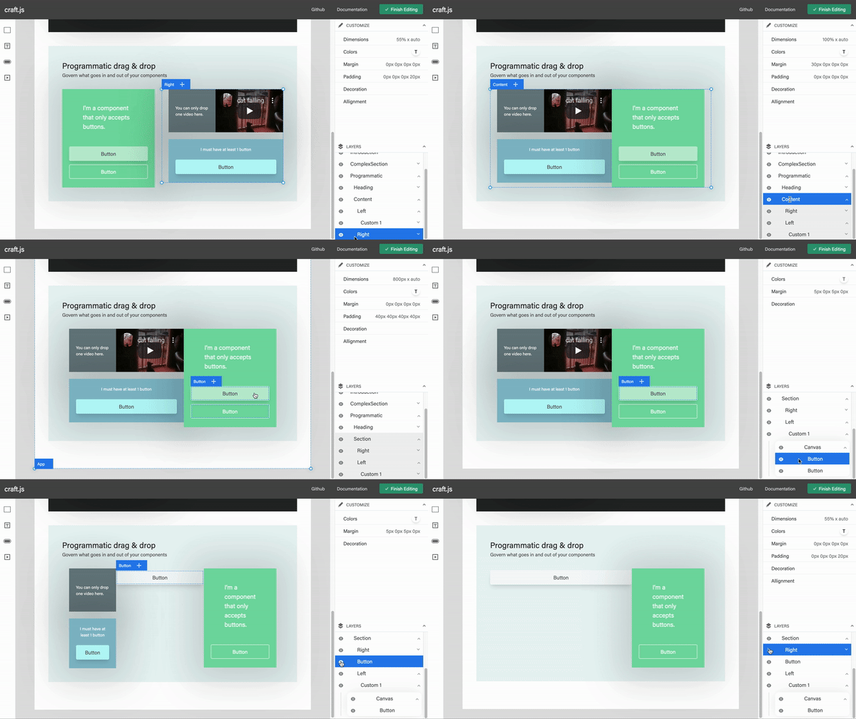
Layers
A Photoshop-like layers panel for your page editor.

Usage
yarn add @craftjs/layers
import React from "react";
import {Editor} from "@craftjs/core"
import {Layers} from "@craftjs/layers"

export default function App() {
  return (
    <div style={{margin: "0 auto", width: "800px"}}>
      <Typography variant="h5" align="center">A super simple page editor</Typography>
      <Editor resolver={...}>
        <Layers />
      </Editor>
    </div>
  );
}
Types
Layer
Properties
idNodeIdA randomly generated unique iddepthnumberA depth of the current LayerexpandedbooleanReturns true if the Layer is expandedeventsObjectselectedbooleanIs true if the layer is clickedhoveredbooleanIs true if the layer is being hovered
domHTMLElementThe DOM of the current layer including its header and children. This is defined by the `connectLayer` connectorheadingDomHTMLElementThe DOM of the current Layer's heading. This is defined by the `connectLayerHeader` connector
Reference
<Layers />
Props
expandRootOnLoad?booleanOptional. If enabled, the Root Node will be expanded by defaultrenderLayer?React.ReactElementOptional. Specify the component to render each layer
useLayer
Parameters
collector(layer: Layer) => CollectedA function that collects relevant state information from the corresponding `Layer`. The component will re-render when the values returned by this function changes.
Returns
- Object
connectorsObjectdrag(dom: HTMLElement, nodeId: String) => HTMLElementSpecifies the DOM that should be draggablelayer(dom: HTMLElement, nodeId: String) => HTMLElementSpecifies the DOM that represents the entire LayerlayerHeading(dom: HTMLElement, nodeId: String) => HTMLElementSpecifies the DOM that represents the layer's heading
actionsObjecttoggleLayer() => voidToggle the corresponding Layer's expanded state
Default components
The following components are available for you to extend if you wish to design your own component to render the layers (which can be specified in the renderLayer prop).
<DefaultLayer /><DefaultLayerHeader /><EditableLayerName>This component enables the end user to edit the layer names. The values are saved into the respective Node'scustom.displayNameprop.
const Layer = () => {
  return (
    <div>
      <DefaultLayerHeader />
    </div>
  )
}

const App = () => {
  return (
    <Editor>
      <Frame>
        ...
      </Frame>
      <Layers
        renderLayer={Layer}
      />
    </Editor>
  )
}