Basic Tutorial
Overview
In this tutorial, we'll be designing a simple page editor. It's recommended that you have a basic to intermediate workings of React and it'd be even better if you first have a quick glance at the Core Concepts and come back here. If you are feeling adventurous, that's fine too.
Installation
yarn add @craftjs/core
or with npm:
npm install --save @craftjs/core
Designing a user interface
With Craft.js you decide how your editor should look and function. So, let's build a user interface for our page editor. We'll add the page editor functionalities later.
To make our lives easier, we'll use some external packages for designing our user interfaces.
yarn add @mui/material react-contenteditable material-ui-color-picker
User Components
Let's first create the User Components - the components that our end users will be able create/edit/move around.
Text
// components/user/Text.js
import React from "react";

export const Text = ({text, fontSize}) => {
  return (
      <div>
         <p style={{fontSize}}>{text}</p>
      </div>
  )
}
Button
// components/user/Button.js
import React  from "react";
import {Button as MaterialButton} from "@mui/material";

export const Button = ({size, variant, color, children}) => {
  return (
    <MaterialButton size={size} variant={variant} color={color}>
      {children}
    </MaterialButton>
  )
}
Container
We will also create a Container component to allow our users to change its background colour and padding.
// components/user/Container.js
import React from "react";
import { Paper } from "@mui/material";

export const Container = ({background, padding = 0, children}) => {
  return (
    <Paper style={{margin: "5px 0", background, padding: `${padding}px`}}>
      {children}
    </Paper>
  )
}
Card
Now, let's create another user component that will be more advanced. It will be composed of the Container component we made earlier, and it will contain two droppable regions; one for text and another for buttons.
// components/user/Card.js
import React  from "react";
import { Text } from "./Text";
import { Button } from "./Button";
import { Container } from "./Container";

export const Card = ({background, padding = 20}) => {
  return (
    <Container background={background} padding={padding}>
      <div className="text-only">
        <Text text="Title" fontSize={20} />
        <Text text="Subtitle" fontSize={15} />
      </div>
      <div className="buttons-only">
        <Button size="small" text="Learn more" variant="contained" color="primary" />
      </div>
    </Container>
  )
}
The Editor
Toolbox
Let's build a "toolbox" which our users will be able to drag and drop to create new instances of those User Components we just defined.
// components/Toolbox.js
import React from "react";
import { Box, Typography, Grid, Button as MaterialButton } from "@mui/material";

export const Toolbox = () => {
  return (
    <Box px={2} py={2}>
      <Grid container direction="column"  alignItems="center" justify="center" spacing={1}>
        <Box pb={2}>
          <Typography>Drag to add</Typography>
        </Box>
        <Grid container direction="column" item>
          <MaterialButton variant="contained">Button</MaterialButton>
        </Grid>
        <Grid container direction="column" item>
          <MaterialButton variant="contained">Text</MaterialButton>
        </Grid>
        <Grid container direction="column" item>
          <MaterialButton variant="contained">Container</MaterialButton>
        </Grid>
        <Grid container direction="column" item>
          <MaterialButton variant="contained">Card</MaterialButton>
        </Grid>
      </Grid>
    </Box>
  )
};
Settings Panel
We also want to create a section here where we can display a bunch of settings which our users can use to edit the props of the user components.
For now, let's just put in some dummy text fields. We'll revisit this in the later sections.
// components/SettingsPanel.js
import React from 'react';
import { Box, Chip, Grid, Typography, Button as MaterialButton, FormControl, FormLabel, Slider } from "@mui/material";

export const SettingsPanel = () => {
  return  (
    <Box bgcolor="rgba(0, 0, 0, 0.06)" mt={2} px={2} py={2}>
      <Grid container direction="column" spacing={0}>
        <Grid item>
          <Box pb={2}>
            <Grid container alignItems="center">
              <Grid item xs><Typography variant="subtitle1">Selected</Typography></Grid>
              <Grid item><Chip size="small" color="primary" label="Selected" /></Grid>
            </Grid>
          </Box>
        </Grid>
        <FormControl size="small" component="fieldset">
          <FormLabel component="legend">Prop</FormLabel>
          <Slider
            defaultValue={0}
            step={1}
            min={7}
            max={50}
            valueLabelDisplay="auto"
          />
        </FormControl>
        <MaterialButton
          variant="contained"
          color="default"
        >
          Delete
        </MaterialButton>
      </Grid>
    </Box>
  )
}
Top bar
Let's design a section that is going to contain a switch for users to disable the editor's functionality and also a button that is simply going to display the serialized output in the browser's console.
// components/Topbar.js
import React from "react";
import { Box, FormControlLabel, Switch, Grid, Button as MaterialButton } from "@mui/material";

export const Topbar = () => {
  return (
    <Box px={1} py={1} mt={3} mb={1} bgcolor="#cbe8e7">
      <Grid container alignItems="center">
        <Grid item xs>
          <FormControlLabel
            control={<Switch checked={true} />}
            label="Enable"
          />
        </Grid>
        <Grid item>
          <MaterialButton size="small" variant="outlined" color="secondary">Serialize JSON to console</MaterialButton>
        </Grid>
      </Grid>
    </Box>
  )
};
Putting it all together
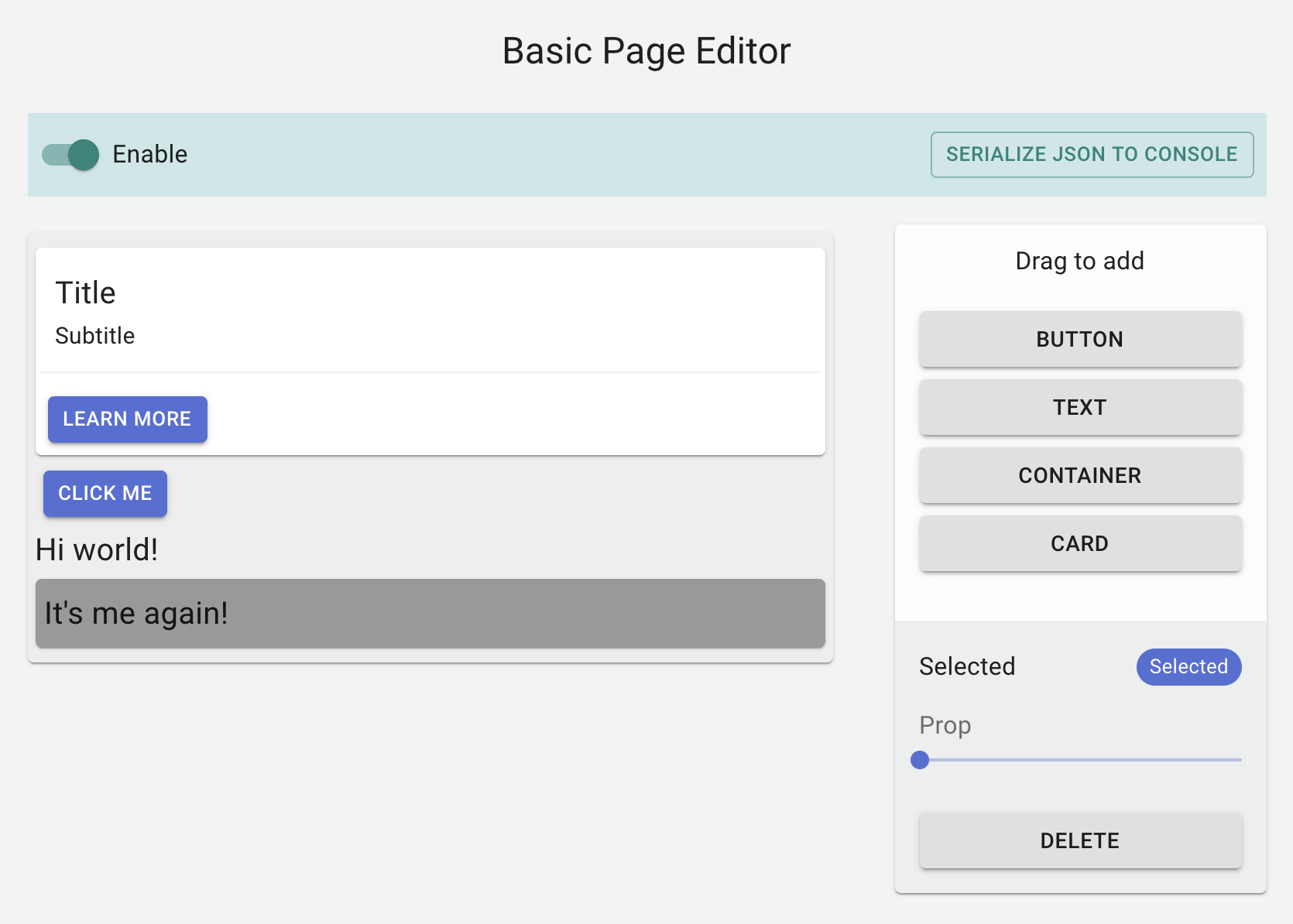
Now, let's put together our entire React application.
// pages/index.js

import React from 'react';
import {Typography, Paper, Grid} from '@mui/material';

import { Toolbox } from '../components/Toolbox';
import { SettingsPanel } from '../components/SettingsPanel';
import { Topbar } from '../components/Topbar';

import { Container } from '../components/user/Container';
import { Button } from '../components/user/Button';
import { Card } from '../components/user/Card';
import { Text } from '../components/user/Text';

export default function App() {
  return (
    <div style={{margin: "0 auto", width: "800px"}}>
      <Typography variant="h5" align="center">A super simple page editor</Typography>
      <Grid container spacing={3} style={{paddingTop: "10px"}}>
        <Topbar />
        <Grid item xs>
          <Container padding={5} background="#eee">
            <Card />
          </Container>
        </Grid>
        <Grid item xs={3}>
          <Paper>
              <Toolbox />
              <SettingsPanel />
          </Paper>
        </Grid>
      </Grid>
    </div>
  );
}
Implementing Craft.js
Up to this point, we have made a user interface for our page editor. Now, let's get it to work!
Setup
- First wrap our application with
<Editor />which sets up the Editor's context. We'll also need to specify the list of user components in theresolverprop for Craft.js to be able to (de)serialize our User Components. - Then wrap the editable area with
<Frame />which passes the rendering process to Craft.js.
// pages/index.js
import React from 'react';
import {Typography, Paper, Grid} from '@mui/material';
import { Toolbox } from '../components/Toolbox';
import { SettingsPanel } from '../components/SettingsPanel';
import { Container } from '../components/user/Container';
import { Button } from '../components/user/Button';
import { Card } from '../components/user/Card';
import { Text } from '../components/user/Text';
import {Editor, Frame, Element} from "@craftjs/core";
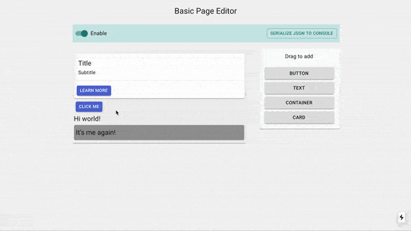
export default function App() {
return (
<div>
<Typography variant="h5" align="center">A super simple page editor</Typography>
<Editor resolver={{Card, Button, Text, Container}}>
<Grid container spacing={3}>
<Grid item xs>
<Frame>
<Container padding={5} background="#eee">
<Card />
<Button size="small" variant="outlined">Click</Button>
<Text size="small" text="Hi world!" />
<Container padding={6} background="#999">
<Text size="small" text="It's me again!" />
</Container>
</Container>
</Frame>
</Grid>
<Grid item xs={3}>
<Paper className={classes.root}>
<Toolbox />
<SettingsPanel />
</Paper>
</Grid>
</Grid>
</Editor>
</div>
);
}
Every element that is rendered in <Frame /> is managed by an object in the editor's internal state called a Node which describes the element, its events, and props among other things.
Whether an element is draggable or droppable (or neither) depends on the type of Node that manages it.
- If the
Nodeis a Canvas, then it's droppable - If the
Nodeis an immediate child of a Canvas, then it's draggable.
By default, every element inside the <Frame /> will have a non-Canvas Node automatically defined for it:
// Explanation
<Frame>
  <Container padding={5} background="#eee"> // Node of type Container
    <Card /> // Node of type Card
    <Button size="small" variant="outlined">Click</Button> // Node of type Button
    <Text size="small" text="Hi world!" /> // Node of type Text
    <Container padding={2} background="#999"> // Node of type Container
       <Text size="small" text="It's me again!" /> // Node of type Text
    </Container>
  </Container>
</Frame>
Hence, by default, all the Nodes above are neither draggable nor droppable. So how can we define some of the Nodes above as a Canvas Node?
We can use the provided <Element /> component to manually define Nodes:
<Frame>
  <Element is={Container} padding={5} background="#eee" canvas> // Canvas Node of type Container, droppable
    <Card /> // Node of type Card
    <Button size="small" variant="outlined">Click</Button> // Node of type Button, draggable
    <Text size="small" text="Hi world!" /> // Node of type Text, draggable
    <Element is={Container} padding={2} background="#999" canvas> // Canvas Node of type Container, droppable and draggable
       <Text size="small" text="It's me again!" /> // Node of type Text, draggable
    </Element>
  </Element>
</Frame>
In the above code, we've wrapped our Container components with <Element /> with the canvas prop, thus making the component droppable and its immediate children, draggable.
Once you've applied these changes and refresh the page, you will notice that absolutely nothing has changed - and that's a good thing!
Enabling Drag and Drop
Inside a User Component, we have access to the useNode hook which provides several information and methods related to the corresponding Node.
The first thing we will need to do is to let Craft.js to manage the DOM of our component. The hook provides connectors which act as a bridge between the DOM and the events in Craft.js:
// components/user/Text.js
import React from "react";
import { Typography } from "@mui/material";
import { useNode } from "@craftjs/core";

export const Text = ({text}) => {
  const { connectors: {connect, drag} } = useNode();
  return (
     <div
      ref={ref => connect(drag(ref))}
    >
      <p>{text}</p>
    </div>
  )
}
Let's break this down a little:
- We passed the
connectconnector to the root element of our component; this tells Craft.js that this element represents the Text component. If the component's corresponding Node is a Canvas, then this also defines the area that is droppable. - Then, we also passed
dragconnector to the same root element; this adds the drag handlers to the DOM. If the component's Node is a child of a Canvas, then the user will be able to drag this element and it will move the entire Text component.
We can also specify additional configuration to our component via the craft prop. Let's define drag-n-drop rules for our Text Component:
export const Text = () => {...}
Text.craft = {
  ...
  rules: {
    canDrag: (node) => node.data.props.text != "Drag"
  }
}
Our Text component can now only be dragged if the text prop is not set to "Drag" 🤪
Nice, now let's enable drag-n-drop for the other User Components:
// components/user/Button.js
export const Button = ({size, variant, color, children}) => {
  const { connectors: {connect, drag} } = useNode();
  return (
    <MaterialButton ref={ ref => connect(drag(ref))} size={size} variant={variant} color={color} >
      ...
    </MaterialButton>
  )
}
// components/user/Container.js
export const Container = ({background, padding = 0, children}) => {
  const { connectors: {connect, drag} } = useNode();
  return (
    <Paper ref={ref=> connect(drag(ref))} style={{ background, padding: `${padding}px`}}>
      ...
    </Paper>
  )
}
// components/user/Card.js (No changes)

// It's not necessary to add connectors for our Card component since it's a composition of our Container component - which already has connectors applied.
export const Card = ({background, padding = 0}) => {
  return (
    <Container background={background} padding={padding}>
      ...
    </Container>
  )
}
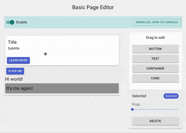
At this point, you could refresh the page and you would be able to drag stuff around.
Defining Droppable regions
Of course, our Card component is supposed to have 2 droppable regions, which means we'll need 2 Canvas nodes.
But hold up, how do we even create a Node inside a User Component? Remember the <Element /> component that was used to define Nodes earlier in our application? Well it can be used here as well.
// components/user/Card.js
import {useNode, Element} from "@craftjs/core";

export const Card = (({bg, padding})) => {
  return (
    <Container background={background} padding={padding}>
      <Element id="text" canvas> // Canvas Node of type div
        <Text text="Title" fontSize={20} />
        <Text text="Subtitle" fontSize={15} />
      </Element>
      <Element id="buttons" canvas> // Canvas Node of type div
        <Button size="small" text="Learn more" />
      </Element>
    </Container>
  )
}
<Element />used inside User Component must specify anidprop
You might be wondering how do we set drag/drop rules for the new droppable regions we made. Currently, we have set the is prop in our <Element /> to a div, but we can actually point it to a User Component.
Hence, we can specify and create a new User Component and define rules via the craft prop just like what we have done previously.
// components/user/Card.js
import React  from "react";
import Text from "./Text";
import Button from "./Button";
import { Element, useNode } from "@craftjs/core";

import { Container }  from "./Container";

// Notice how CardTop and CardBottom do not specify the drag connector. This is because we won't be using these components as draggables; adding the drag handler would be pointless.

export const CardTop = ({children}) => {
  const { connectors: {connect} } = useNode();
  return (
    <div ref={connect} className="text-only">
      {children}
    </div>
  )
}

CardTop.craft = {
  rules: {
    // Only accept Text
    canMoveIn: (incomingNodes) => incomingNodes.every(incomingNode => incomingNode.data.type === Text)
  }
}

export const CardBottom = ({children}) => {
  const { connectors: {connect} } = useNode();
  return (
    <div ref={connect}>
      {children}
    </div>
  )
}

CardBottom.craft = {
  rules: {
    // Only accept Buttons
    canMoveIn : (incomingNodes) => incomingNodes.every(incomingNode => incomingNode.data.type === Button)
  }
}

export const Card = ({background, padding = 20}) => {
  return (
    <Container background={background} padding={padding}>
      <Element id="text" is={CardTop} canvas> // Canvas Node of type CardTop
        <Text text="Title" fontSize={20} />
        <Text text="Subtitle" fontSize={15} />
      </Element>
      <Element id="buttons" is={CardBottom} canvas> // Canvas Node of type CardBottom
        <Button size="small" text="Learn more" />
      </Element>
    </Container>
  )
}
Remember that every User Component must be added to our resolver, so let's add CardTop and CardBottom:
...
export default function App() {
  return (
    ...
        <Editor
          resolver={{Card, Button, Text, CardTop, CardBottom}}
        >
         ...
        </Editor>
     ...
  );
}

Implementing the Toolbox
Let's go back to our Toolbox component and modify it so that dragging those buttons into the editor will create new instances of the user components they represent. Just as useNode provides methods and information related to a specific Node, useEditor specifies methods and information related to the entire editor's state.
The useEditor also provides connectors; the one we are interested in right now is create which attaches a drag handler to the DOM specified in its first argument and creates the element specified in its second arguement.
// components/Toolbox.js
import React from "react";
import { Box, Typography, Grid, Button as MaterialButton } from "@mui/material";
import { Element, useEditor } from "@craftjs/core";
import { Container } from "./user/Container";
import { Card } from "./user/Card";
import { Button } from "./user/Button";
import { Text } from "./user/Text";

export const Toolbox = () => {
  const { connectors, query } = useEditor();

  return (
    <Box px={2} py={2}>
      <Grid container direction="column"  alignItems="center" justify="center" spacing={1}>
        <Box pb={2}>
          <Typography>Drag to add</Typography>
        </Box>
        <Grid container direction="column" item>
          <MaterialButton ref={ref=> connectors.create(ref, <Button text="Click me" size="small" />)} variant="contained">Button</MaterialButton>
        </Grid>
        <Grid container direction="column" item>
          <MaterialButton ref={ref=> connectors.create(ref, <Text text="Hi world" />)} variant="contained">Text</MaterialButton>
        </Grid>
        <Grid container direction="column" item>
          <MaterialButton ref={ref=> connectors.create(ref, <Element is={Container} padding={20} canvas />)} variant="contained">Container</MaterialButton>
        </Grid>
        <Grid container direction="column" item>
          <MaterialButton ref={ref=> connectors.create(ref, <Card />)} variant="contained">Card</MaterialButton>
        </Grid>
      </Grid>
    </Box>
  )
};
Notice for our Container component, we wrapped it with the <Element canvas /> - this will allow our users to drag and drop a new Container component that is droppable.
Now, you can drag and drop the Buttons, and they will actually create new instances of our User Components.
Making the components editable
Up until this point, we have a page editor where our users can move elements around. But, we are missing one important thing - enabling our users to edit the components' props.
The useNode hook provides us with the method setProp which can be used to manipulate a component's props. Let's implement a content editable for our Text Component:
For simplicity's sake, we will be using react-contenteditable
import React, {useCallback} from "react";
import ContentEditable from 'react-contenteditable'

export const Text = ({text, fontSize}) => {
  const { connectors: {connect, drag}, actions: {setProp} } = useNode();

  return (
     <div
      ref={ref => connect(drag(ref))}
    >
      <ContentEditable
        html={text}
        onChange={e =>
          setProp(props =>
            props.text = e.target.value.replace(/<\/?[^>]+(>|$)/g, "")
          )
        }
        tagName="p"
        style={{fontSize: `${fontSize}px`, textAlign}}
      />
    </div>
  )
}
But let's only enable content editable only when the component is clicked when it's already selected; a double click is essential.
The useNode hook accepts a collector function which can be used to retrieve state information related to the corresponding Node:
// components/user/Text.js
export const Text = ({text, fontSize}) => {
  const { connectors: {connect, drag}, hasSelectedNode, hasDraggedNode, actions: {setProp} } = useNode((state) => ({
    hasSelectedNode: state.events.selected,
    hasDraggedNode: state.events.dragged
  }));

  const [editable, setEditable] = useState(false);

  useEffect(() => {!hasSelectedNode && setEditable(false)}, [hasSelectedNode]);

  return (
     <div
      ref={ref => connect(drag(ref))}
      onClick={e => setEditable(true)}
    >
      <ContentEditable
        disabled={!editable}
       ...
      />
    </div>
  )
}

This should give you an idea of the possibilities of implementing powerful visual editing features like what you'd see in most modern page editors.
While we are at it, let's also add a slider for users to edit the fontSize
// components/user/Text.js
import {Slider, FormControl, FormLabel} from "@mui/material";

export const Text= ({text, fontSize, textAlign}) => {
  const { connectors: {connect, drag}, hasSelectedNode, hasDraggedNode, actions: {setProp} } = useNode((state) => ({
    hasSelectedNode: state.events.selected,
    hasDraggedNode: state.events.dragged
  }));

  ...

  return (
    <div {...}>
      <ContentEditable {...} />
      {
        hasSelectedNode && (
          <FormControl className="text-additional-settings" size="small">
            <FormLabel component="legend">Font size</FormLabel>
            <Slider
              defaultValue={fontSize}
              step={1}
              min={7}
              max={50}
              valueLabelDisplay="auto"
              onChange={(_, value) => {
                setProp(props => props.fontSize = value);
              }}
            />
          </FormControl>
        )
      }
    </div>
  )
}
We can agree that it does not look all that good since it obstructs the user experience. Wouldn't it be better if the entire .text-additional-settings Grid is relocated to the Settings Panel that we created earlier?
The question is, how will the Settings Panel be able render the .text-additional-settings when our Text component is selected?
This is where Related Components become useful. Essentially, a Related Component shares the same Node context as our actual User component; it can make use of the useNode hook. Additionally, a Related Component is registered to a component's Node, which means we can access and render this component anywhere within the editor.
// components/user/Text.js
export const Text = ({text, fontSize}) => {
  const { connectors: {connect, drag}, isActive, actions: {setProp} } = useNode((node) => ({
    isActive: node.events.selected
  }));

  ...
  return (
    <div {...}>
      <ContentEditable {...} />
    </div>
  )
}

const TextSettings = () => {
  const { actions: {setProp}, fontSize } = useNode((node) => ({
    fontSize: node.data.props.fontSize
  }));

  return (
    <>
      <FormControl size="small" component="fieldset">
        <FormLabel component="legend">Font size</FormLabel>
        <Slider
          value={fontSize || 7}
          step={7}
          min={1}
          max={50}
          onChange={(_, value) => {
            setProp(props => props.fontSize = value);
          }}
        />
      </FormControl>
    </>
  )
}

Text.craft = {
  ...
  related: {
    settings: TextSettings
  }
}
Before we move on to the Settings Panel, let's quickly do the same for the other User Components:
// components/user/Button.js
import {Button as MaterialButton, Grid, FormControl, FormLabel, RadioGroup,Radio, FormControlLabel} from "@mui/material";
export const Button = () => {}


const ButtonSettings = () => {
  const { actions: {setProp}, props } = useNode((node) => ({
    props: node.data.props
  }));

  return (
    <div>
      <FormControl size="small" component="fieldset">
        <FormLabel component="legend">Size</FormLabel>
        <RadioGroup defaultValue={props.size} onChange={(e) => setProp(props => props.size = e.target.value )}>
          <FormControlLabel label="Small" value="small" control={<Radio size="small" color="primary" />} />
          <FormControlLabel label="Medium" value="medium" control={<Radio size="small" color="primary" />} />
          <FormControlLabel label="Large" value="large" control={<Radio size="small" color="primary" />} />
        </RadioGroup>
      </FormControl>
      <FormControl component="fieldset">
        <FormLabel component="legend">Variant</FormLabel>
        <RadioGroup defaultValue={props.variant} onChange={(e) => setProp(props => props.variant = e.target.value )}>
          <FormControlLabel label="Text" value="text" control={<Radio size="small" color="primary" />} />
          <FormControlLabel label="Outlined" value="outlined" control={<Radio size="small" color="primary" />} />
          <FormControlLabel label="Contained" value="contained" control={<Radio size="small" color="primary" />} />
        </RadioGroup>
      </FormControl>
      <FormControl component="fieldset">
        <FormLabel component="legend">Color</FormLabel>
        <RadioGroup defaultValue={props.color} onChange={(e) => setProp(props => props.color = e.target.value )}>
          <FormControlLabel label="Default" value="default" control={<Radio size="small" color="default" />} />
          <FormControlLabel label="Primary" value="primary" control={<Radio size="small" color="primary" />} />
          <FormControlLabel label="Seconday" value="secondary" control={<Radio size="small" color="primary" />} />
        </RadioGroup>
      </FormControl>
    </div>
  )
};

Button.craft = {
  related: {
    settings: ButtonSettings
  }
}
// components/user/Container.js
import {FormControl, FormLabel, Slider} from "@mui/material";
import {HexColorPicker} from 'react-colorful'

export const Container = () => {...}

export const ContainerSettings = () => {
  const { background, padding, actions: {setProp} } = useNode(node => ({
    background: node.data.props.background,
    padding: node.data.props.padding
  }));
  return (
    <div>
      <FormControl fullWidth={true} margin="normal" component="fieldset">
        <FormLabel component="legend">Background</FormLabel>
        <HexColorPicker color={background || '#000'} onChange={color => {
          setProp(props => props.background = color)
        }} />
      </FormControl>
      <FormControl fullWidth={true} margin="normal" component="fieldset">
        <FormLabel component="legend">Padding</FormLabel>
        <Slider defaultValue={padding} onChange={(_, value) => setProp(props => props.padding = value)} />
      </FormControl>
    </div>
  )
}

Container.craft = {
  related: {
    settings: ContainerSettings
  }
}
// components/user/Card.js
import {ContainerSettings} from "./Container";

export const Card({background, padding = 20}) { ... }

Card.craft = {
  related: {
    // Since Card has the same settings as Container, we'll just reuse ContainerSettings
    settings: ContainerSettings
  }
}
Setting default props
Setting default props is not strictly necessary. However, it is helpful if we wish to access the component's props via its corresponding Node, like what we did in the settings related component above.
For instance, if a Text component is rendered as <Text text="Hi" />, we would get a null value when we try to retrieve the fontSize prop via its Node. An easy way to solve this is to explicity define each User Component's props:
// components/user/Text.js
export const Text = ({text, fontSize}) => {}

Text.craft = {
  props: {
    text: "Hi",
    fontSize: 20
  },
  rules: {...},
  related: {...}
}
// components/user/Button.js
export const Button = ({size, variant, color, text}) => {}

Button.craft = {
  props: {
    size: "small",
    variant: "contained",
    color: "primary",
    text: "Click me"
  },
  related: {...}
}
// components/user/Container.js
export const Container = ({background, padding}) => {}

// We export this because we'll be using this in the Card component as well
export const ContainerDefaultProps = {
  background : "#ffffff",
  padding: 3
};

Container.craft = {
  props: ContainerDefaultProps,
  related: {...}
}
// components/user/Card.js
import {ContainerDefaultProps} from "./Container";

export const Card = ({background, padding}) => {}

Card.craft = {
  props: ContainerDefaultProps,
  related: {...}
}
Settings Panel
We need to get the currently selected component which can be obtained from the editor's internal state. Similar to useNode, a collector function can be specified to useEditor. The difference is here, we'll be dealing with the editor's internal state rather than with a specific Node:
const { currentlySelectedId } = useEditor((state) => {
  const [currentlySelectedId] = state.events.selected;
  return {
    currentlySelectedId
  }
})
Note: state.events.selected is of type
Set<string>. This is because in the case of multi-select, it's possible for the user to select multiple Nodes by holding down the<meta>key.
Now, let's replace the placeholder text fields in our Settings Panel with the settings Related Component:
// components/SettingsPanel.js

import { Box, Chip, Grid, Typography, Button as MaterialButton } from "@mui/material";
import { useEditor } from "@craftjs/core";

export const SettingsPanel = () => {
  const { selected } = useEditor((state) => {
    const [currentNodeId] = state.events.selected;
    let selected;

    if ( currentNodeId ) {
      selected = {
        id: currentNodeId,
        name: state.nodes[currentNodeId].data.name,
        settings: state.nodes[currentNodeId].related && state.nodes[currentNodeId].related.settings
      };
    }

    return {
      selected
    }
  });

  return selected ? (
    <Box bgcolor="rgba(0, 0, 0, 0.06)" mt={2} px={2} py={2}>
      <Grid container direction="column" spacing={0}>
        <Grid item>
          <Box pb={2}>
            <Grid container alignItems="center">
              <Grid item xs><Typography variant="subtitle1">Selected</Typography></Grid>
              <Grid item><Chip size="small" color="primary" label={selected.name} /></Grid>
            </Grid>
          </Box>
        </Grid>
        {
          selected.settings && React.createElement(selected.settings)
        }
        <MaterialButton
          variant="contained"
          color="default"
        >
          Delete
        </MaterialButton>
      </Grid>
    </Box>
  ) : null
}
Now, we have to make our Delete button work. We can achieve this by using the delete action available from the useEditor hook.
Also, it's important to note that not all nodes are deletable - if we try to delete an undeletable Node, it'll result in an error. Hence, it's good to make use of the helper methods which helps describe a Node. In our case, we would like to know if the currently selected Node is deletable before actually displaying the "Delete" button. We can access the helper methods via the node query in the useEditor hook.
// components/SettingsPanel.js

export const SettingsPanel = () => {
  const { actions, selected } } = useEditor((state, query) => {
    const [currentNodeId] = state.events.selected;
    let selected;

    if ( currentNodeId ) {
      selected = {
        id: currentNodeId,
        name: state.nodes[currentNodeId].data.name,
        settings: state.nodes[currentNodeId].related && state.nodes[currentNodeId].related.settings,
        isDeletable: query.node(currentNodeId).isDeletable()
      };
    }

    return {
      selected
    }
  });

  return selected ? (
    <Box bgcolor="rgba(0, 0, 0, 0.058823529411764705)" mt={2} px={2} py={2}>
      <Grid container direction="column" spacing={0}>
        ...
        {
          selected.isDeletable ? (
            <MaterialButton
              variant="contained"
              color="default"
              onClick={() => {
                actions.delete(selected.id);
              }}
            >
              Delete
            </MaterialButton>
          ) : null
        }
      </Grid>
    </Box>
  ) : null
}
Topbar
This is the last part of the editor that we have to take care of and then we're done!
First, we can get the editor's enabled state by passing in a collector function just like what we did before. Then, we can use the setOptions action to toggle the enabled state.
Lastly, the useEditor hook also provides query methods which provide information based the editor'state. In our case, we would like to get the current state of all the Nodes in a serialized form; we can do this by calling the serialize query method.
// components/Topbar.js
import React from "react";
import { Box, FormControlLabel, Switch, Grid, Button as MaterialButton } from "@mui/material";
import { useEditor } from "@craftjs/core";

export const Topbar = () => {
  const { actions, query, enabled } = useEditor((state) => ({
    enabled: state.options.enabled
  }));

  return (
    <Box px={1} py={1} mt={3} mb={1} bgcolor="#cbe8e7">
      <Grid container alignItems="center">
        <Grid item xs>
          <FormControlLabel
            control={<Switch checked={enabled} onChange={(_, value) => actions.setOptions(options => options.enabled = value)} />}
            label="Enable"
          />
        </Grid>
        <Grid item>
          <MaterialButton
            size="small"
            variant="outlined"
            color="secondary"
            onClick={() => {
              console.log(query.serialize())
            }}
          >
              Serialize JSON to console
          </MaterialButton>
        </Grid>
      </Grid>
    </Box>
  )
};
We'll explore how to compress the JSON output and have the editor load from the serialised JSON in the Save and Load guide.
You made it 🎉
We've made it to the end! Not too bad right? Hopefully, you're able to see the simplicity of building a fully working page editor with Craft.js.
We do not need to worry about implementing the drag-n-drop system but rather simply focus on writing rules and attaching connectors to the desired elements.
When it comes to writing the components themselves, it is the same as writing any other React component - you control how the components react to different editor events and how they are edited.